Here is a presentation and interactive map that shows where the Residential Infill Project will apply and what is at risk of displacement by RIP-fueled infill redevelopment.
Use the arrows to step through the slides. Dark gray shows the RIP zone, which is almost all of Portland’s neighborhoods. The RIP will re-zone all of that area to be “redeveloped” from single family houses to new quadplexes, three stories tall and 4,000 sq ft or larger.
Actually, there is already multi-family housing in the RIP zone. On slide 6, the presentation shows the existing multi-family buildings in the RIP zone. ADUs are bright green, duplexes are light blue, etc. These are mostly older duplexes and single family houses with ADUs that are among the most affordable housing in the neighborhood. These occupants are at risk of displacement when developers replace these older buildings with new infill development.
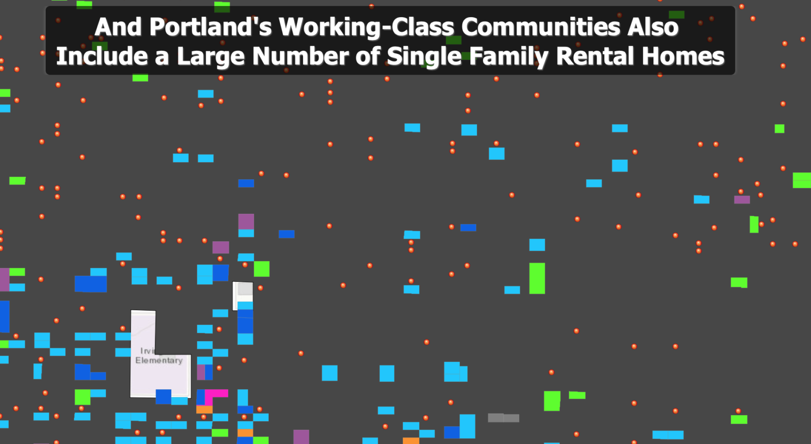
On slide 7, the presentation will show all the rental single family houses in the RIP zone. These are even more households who are at risk of displacement when infill developers replace their homes with new quadplexes.
If the households are lower-income or even median-income, they are particularly at risk. New infill development is among the most expensive housing in the neighborhood.
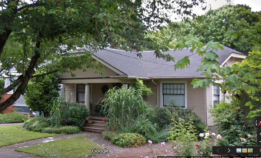
Here’s example of this infill development:
A smaller, older house is bought. Here, a 1921 bungalow, bought for $450,000.

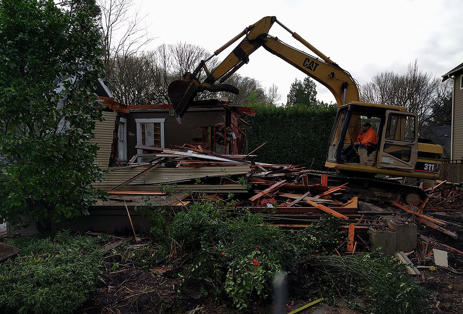
The demolition day.

First the fence, then the heavy equipment
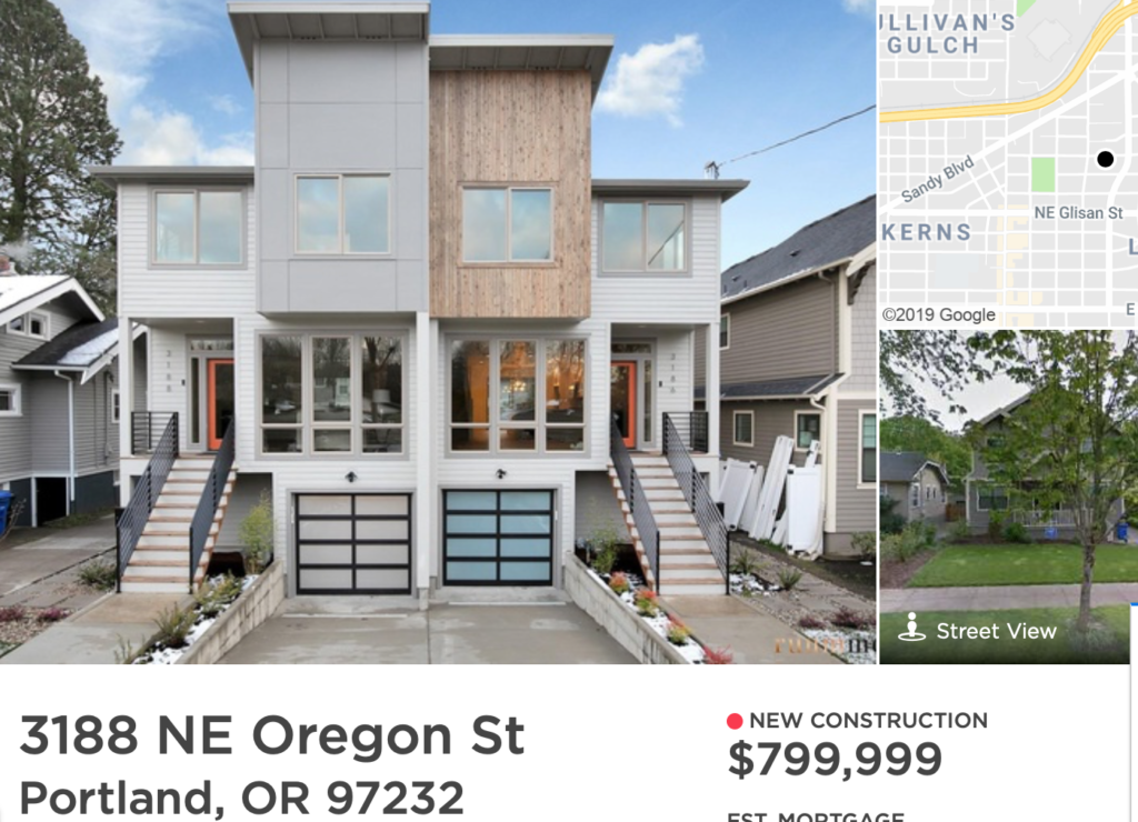
The new infill housing – each unit is almost double the price of the original house. That’s how infill developers make profits – not by making anything affordable.

The map shows you the RIP zone that will be re-zoned for infill development.
The map is interactive. You can move it around and zoom in and out, to show any neighborhood, including your own.
